UX Case Study:
Elevating Morningstar Sustainalytics’ digital presence
This case study explores the overhaul of Morningstar Sustainalytics’ main marketing platform (.COM). This website, while functional, has been identified to have several areas of improvement that, if addressed, could substantially elevate the company’s digital presence, user engagement, and lead generation.

Challenge
In the three years since the last major update, the digital landscape of the company has evolved significantly, unveiling critical areas that demand immediate attention. The introduction of a new business unit necessitated an online presence blending varied content complexities, further complicating the site architecture. This expansion, while essential, inadvertently contributed to a fragmented user experience, marked by inconsistent design elements that disrupt the cohesive flow users deserve.
Feedback highlighted multiple complaints regarding confusing navigation, pointing to underlying complexities that hinder a seamless experience for all user segments. Moreover, this convoluted navigation structure has significantly underperformed in lead generation, failing to effectively capture and manage business leads.
In response to these issues, the marketing team has challenged the UX team to devise innovative design solutions. Addressing these challenges is paramount as the company strives to refine its digital presence, ensuring a streamlined, intuitive user experience that not only meets but exceeds the expectations of its diverse user base.
My Role
As the UX lead, my role involved:
UX Strategy: design goal setting, stakeholder mapping, competitive analysis, user segmentation.
User Research & Synthesis: surveys and interviews, analytics review, user personas and journey maps.
Ideation & Prototyping: wireframing, design exploration, feedback integration.
Visual Design & Testing: branding consistency, design system enhancement, responsive design, interactive elements, accessibility, usability testing, performance testing, SEO testing.
Collaboration: Marketing Leadership and Managers, Web Tech team.
Solution
In a collaborative effort that brought together the expertise of the UX, marketing, and web tech teams, a unique vision and strategy were crafted to tackle the main challenges head-on. This synergy led to the introduction of an intuitive design solution, seamlessly combining easy-to-follow navigation with a unified and coherent content and visual language, alongside innovative interactions for lead generation.
Anchored by a well-established UX process, the team continuously expanded its knowledge about users and the platform's offerings, ensuring that every decision was informed and purposeful. This rigorous approach resulted in the development of dozens of new ideas, all adhering to user-centered principles.
Special emphasis was placed on carefully developing user flows for the main scenarios, ensuring that each interaction was thoughtfully crafted to meet user needs and enhance the overall experience. This strategic and collaborative approach not only addressed existing issues but also set a new standard for excellence in user experience design.
Redefinition of Site Structure: The global navigation underwent a meticulous redesign, focusing on an intuitive, user-centric information architecture. This redefined site structure simplified access to key information, ensuring users could navigate the website with ease and efficiency.
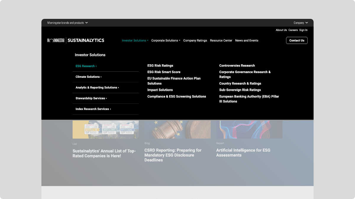
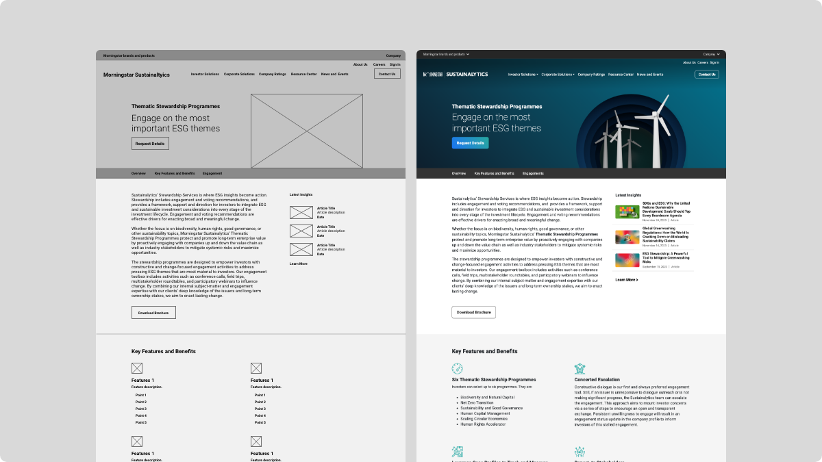
Unified Content and Visual Design Templates: A coherent set of content and visual design templates was established, creating a consistent look and feel across the entire website. This standardization not only improved the aesthetic appeal but also contributed to a more predictable and user-friendly experience, reinforcing the brand's identity across all web pages.


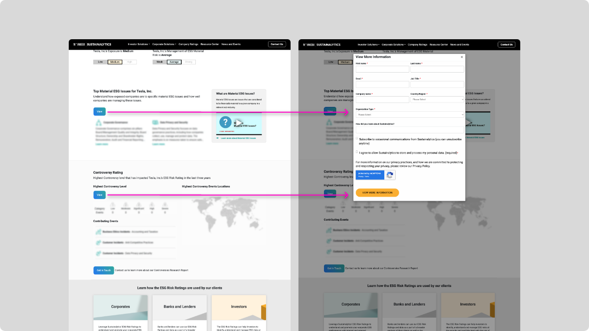
Innovative Lead Generation Interactions: New lead generation interactions were carefully crafted, incorporating dynamic forms, engaging call-to-action (CTA) buttons tailored to user behavior and a chat widget. These interactive elements were designed to captivate users’ attention, encouraging them to engage more deeply with the content and ultimately facilitating a smoother lead capture process. These elements were connected to HubSpot, Eloqua, and Salesforce.

Approach
Research and Strategy
Balancing the needs of Institutional Investors and Corporate content under one umbrella
These two user segments have distinct content requirements, navigation preferences, and engagement strategies, making it essential to cater to both groups effectively without compromising the experience for either.
A user-centric information architecture was pivotal in addressing this challenge, ensuring that both sets of users found the website intuitive, informative, and engaging. Here’s how a user-centric approach to information architecture played a crucial role in solving this problem:
Understanding User Needs and Preferences
The first step involved deeply understanding the needs, behaviors, and preferences of both Institutional Investors and Corporate clients. This was achieved through user research methods such as surveys, interviews, and analysis of user interaction data.

Segment-Specific Navigation Paths
To accommodate the distinct needs of Institutional Investors and Corporate clients, the website's information architecture was designed to offer segment-specific navigation paths. This meant creating clear, intuitive entry points from the homepage and throughout the site that directed each user type to the content most relevant to them.


Design and Prototyping
Unified Yet Diverse Content Strategy
A key aspect of the solution was developing a content strategy that balanced unity with diversity. The website needed to maintain a cohesive brand voice and visual identity while delivering content that catered to the specific interests and needs of each user segment. This was achieved by standardizing content formats and visual templates across the site, ensuring a consistent user experience, while customizing the content within those formats to appeal to the distinct audiences.
Mobile-first Approach
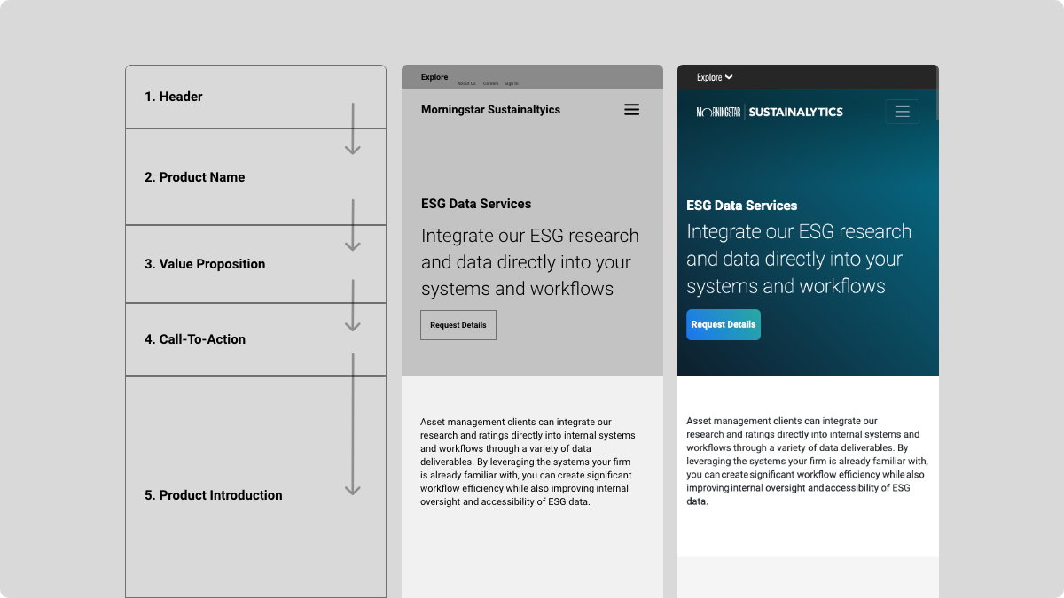
I proposed the use of a “Content Priority Guide” that help identify all content for each unique page. This approach breaks the content into items and puts them in priority order using only text. This also helps with a mobile-first approach to the site.
Special attention was given to the presentation of data, insights, and solutions that resonated with Institutional Investors and Corporate clients' unique challenges and goals.


Collaboration and Iteration
Testing and Feedback Loops
Continuous testing and feedback loops were essential in refining the solution to ensure it effectively balanced the needs of both user segments. Usability testing, A/B testing, and user feedback were regularly collected and analyzed to understand how well the site architecture and content strategy were meeting the needs of Institutional Investors and Corporate clients.
Results
Overall reception of the new site was very positive with a notable user engagement improvement of 45%. This included average session durations and significant decrease in bounce rates.
The simplified user journeys led to an uptick in conversions, directly contributing to an uplift in sales.
The improved site information architecture and SEO features boosted our search engine rankings, resulting in higher volume of organic traffic.
This project not only achieved its primary objectives but also set a new benchmark for all digital properties in terms of excellence and performance.
Key Takeaways
Holistic User Experience Design: This project underscored the importance of adopting a holistic approach to user experience design. By considering all facets—from navigation to lead generation and content prioritization—we were able to create a more seamless and engaging user experience that not only meets but exceeds user expectations.
Collaborative Feedback Loops: The project highlighted the critical value of establishing collaborative feedback loops. These loops enabled the continuous refinement and optimization of design choices, ensuring that the final product was not only functional but also highly intuitive and user-friendly.
Cross-Functional Collaboration: One of the key takeaways was the undeniable value of collaboration between different teams and disciplines, including UX/UI designers, content creators, marketers, sales personnel, and developers. This cross-functional approach fostered a more comprehensive understanding of both user needs and business goals, leading to more effective and encompassing solutions. The synergy between these diverse teams was instrumental in crafting a product that was not just aesthetically pleasing but also highly functional and aligned with strategic objectives.
Thanks for reading!
I'd gladly provide a detailed walkthrough upon request.